I helped maintain and evolve the design system by translating the brand team's new brand architecture into practical UI and refining our Figma libraries, so they're tightly aligned with a cohesive visual language.
Role
Designer
Tool
Figma
Illustrator
Photoshop
Tokens Studio
Deliverables
Component library
Logo lockups
Icon library
Interactive components library
Design tokens
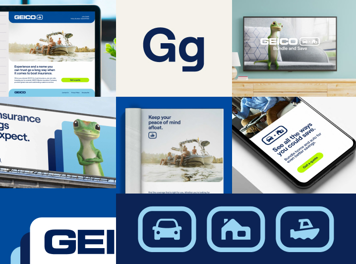
The design system needed to evolve to match the new brand architecture coming from marketing. There was a clear gap in visual language and tone between marketing and product, so I led the effort to close that gap by unifying the visual language. I partnered closely with cross-functional teams to ensure the design system implementation of the brand updates was consistent everywhere it showed up.
Marketing and Product were working in silos and had little communication over design languages. To close the gap between marketing and product, I kicked off discovery sessions with key stakeholders across teams to understand how teams across the department process and build as it comes to retaining the brand visuals. These conversations helped me identify the gaps, the different mindsets of design process and approach. During this stage, I wanted to set expectations for both departments to ensure what gets implemented to the existing design system and share level of efforts and implementation timelines.
While each department had been built to solve specific needs, the discovery work surfaced clear opportunities to tighten alignment, improve consistency, and make collaboration smoother by addressing the following findings:
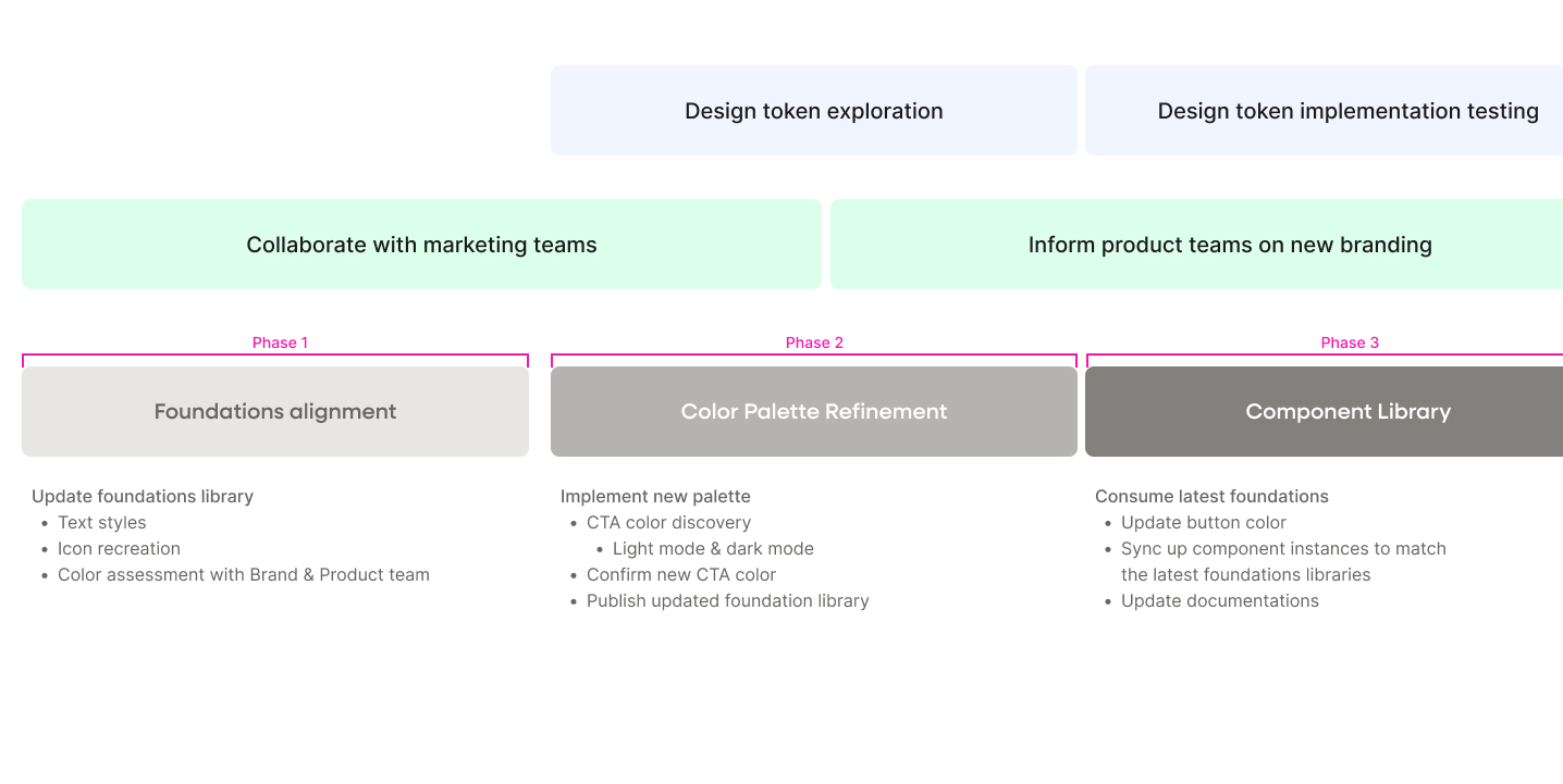
I developed a phased migration strategy to implement the new branding into the design system. The plan balances team capacity, product release schedules, and business priorities. To minimize disruption, I worked in dedicated Figma branches of the main library files.
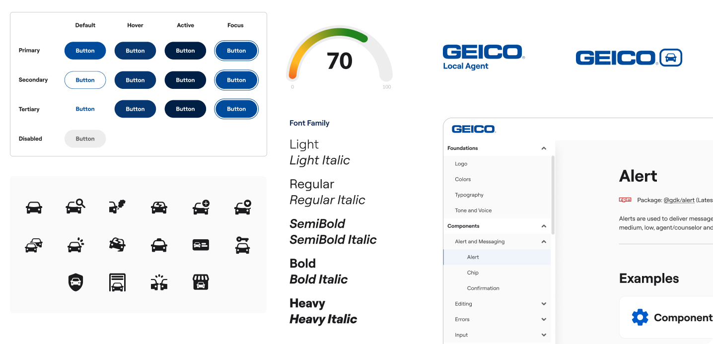
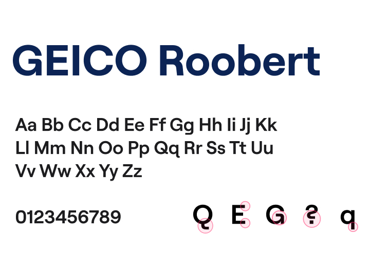
The brand update introduced a new custom font created specifically for GEICO. Since the design system only used one typeface, the font implementation was straightforward. I install the new font to Figma and updated all of the text styles.
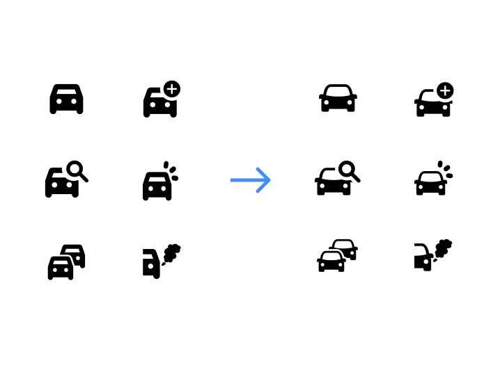
The new icon style featured more rounded corners compared to the existing collection. I recreated multiple product icons in the new style, accounting for the various versions needed for different use cases of the product.
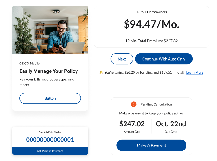
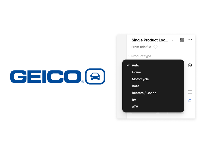
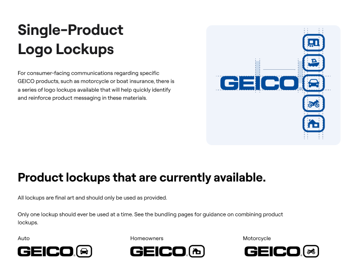
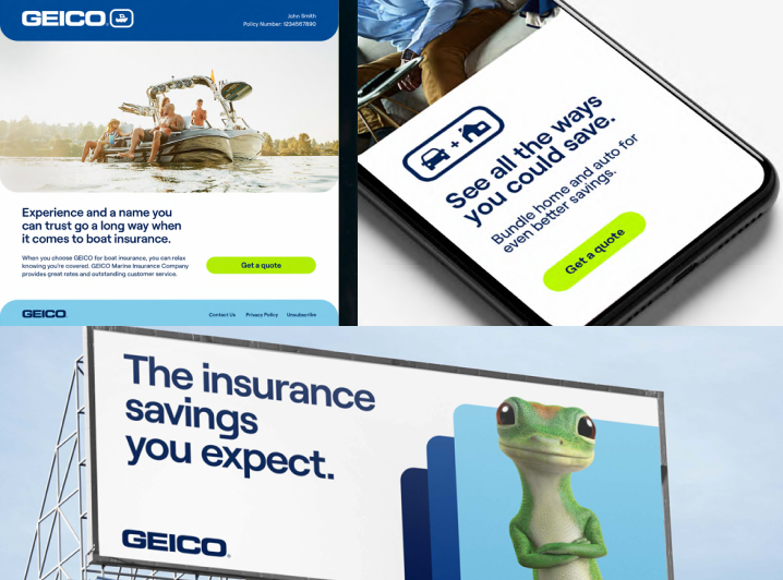
Marketing introduced new logo lockups for single product, bundling, suite, audience, and partnership. These lockup helps strengten and reinforce messaging of GEICO products.
I turned the lockups into components and added properties for product selection and variant type. I paired each logo lockup with clear documentation on usage.
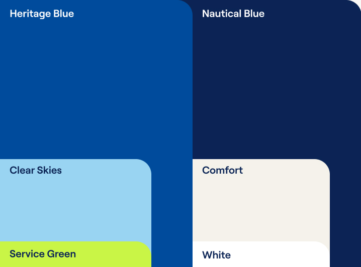
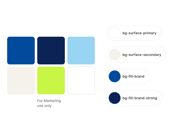
I assessed the new color palette with Marketing's Creative and Brand team to understand how they were applying it across campaign creatives. I compared that usage against Product's needs and found that color roles were being defined and applied differently between teams. This review also surfaced accessibility concerns with certain combinations that would not work for UI design.
Through a series of cross-functional huddles, we aligned on how to apply the new colors across both teams by defining clear roles and restricting combinations that failed accessibility standards. Those decisions were rolled into the design system to improve consistency between marketing and product materials.
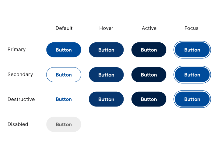
Once the color roles were aligned, I scoped the work to update the button component with the new brand color. I audited existing variants, interactive states, and token dependencies to understand what needed to change.
I reworked our token structure by introducing interactive tokens for hover, pressed, focus, and disabled so future color updates are more flexible and structured.
After the new structure was in place, I updated the button component and repaired broken instance links so existing designs would inherit the changes correctly.